I'm a great fan of the use of a single bright and outstanding colour in this spread, it works really well with the grey scale images. The colour attracts the eyes to the text as well as the images around it very effectively and the way in which the bright colour is slightly incorporated on the left page helps attach both sides together. Also the clever use of the arrow also helps to send the readers view to the next page which means that both pages are receiving equals amount of attention from the reader. I'm also a fan of the unconventional heading of the extract, I think it works well with the quirkiness of the spread and is quite subtle.
Friday, 28 February 2014
Magazine Research 9
This is a double page spread that shows an adventurous layout. It looks like a spread that has had a lot of time and effort dedicated to it as well as planning. The colours are all of a similar theme and compliment the overall design. The text style, composition and colours work so well that it comes across as aesthetically pleasing and works well as the information and design come together as a whole and not as two separate things.
Magazine Research 8
Final Magazine Advert
I've chosen to have this as my final advert design because overall it presents the artist clearly through the main image which is a vital piece of information for the audience. Also the use of the artist name and title of sing instantly confirms who the artist is and what the album is named. By using star rating from some of the biggest music institutions, I can draw in the audience's attention and make it appear as though the design is advertising an incredibly successful and outstanding album. I've also added additional information towards the bottom of the page about website links that belong to the artist, this allows me to add additional advertisement and give another option for the audience to seek more information. Finally I've finished the advert with more information which is shown as the photographers name, production company logo and copyright control. By using all these conventions of a magazine advertisement I believe I've made a successful advertising product.
Magazine Research 7
Magazine Advertisement Development
A2 MEDIA STUDIES
A2 MEDIA STUDIES
These are some magazine adverts that I'd created myself during my second year of college. Studying Media Studies helped me a lot when learning about the conventions of magazines and how they work therefore I plan to reference what I've learnt during my college years when creating the final magazine.
Magazine Research 6
Magazine Advertisement Of Music Artists
By looking at these magazine adverts I can begin to create my own advert whilst using the magazines as a guide. I've selected a variety of adverts with artists that create music which are categorised in different genres to one another.
These first two adverts advertise the artists more than their music. The achievements of the artista are presented briefly but the main attention of the entire page is on the artist.
However these adverts advertise the latest single/album of the artist as well as the artist themselves, this allows the latest achievement of an artist to be recognised. I've selected advertisements that are showing artists of different genres due to not being able to find an advert which shows Soul/Pop artists that are female.
These are a few posters that I'd looked at in my college years that related to magazine adverts.
Magazine Research 5
Conventions Of A Magazine Advertisement
- Representative visual image for the artist's identity.
- Artist name
- Title of the song/album
- Release of album/single
- Extra features
- Tour dates
- Production company name/logo
- Website information
- Photographer
- Relevant background for the genre
- Font and colour of the text
- Logos of where the album/single is avaliable
Magazine Research 4
AS Level Media Studies
These are some magazine pages that I created during my first year of college as a quick project just to explore how much I already knew and learnt about the conventions of a magazine and how magazine's work. I managed to quickly create a magazine based on the theme of music by using my friends as made up music artists. At first I was very pleased with what I had created but looking back on it now, the outcomes look very overcrowded and I would definately changed the chosen font. Apart from that I'm still rather pleased of what I've had made back the, despite having only just started the course.
Magazine Research 3
Bed Head Nylon Magazine Ad
FOOD ONE X BED HEAD Double-Page Ad in the May issue of Nylon Magazine. On newsstands now.
Jim Mahfood aka Food One is a freelance artist working professionally in the fields of illustration, advertising, comic books, murals, fine art, animation, live art in nightclubs, and custom body-painting. He has worked for every major comic book company and his illustrations have appeared in such publications as Playboy, Spin, Spectrum Illustration Annual, Star Wars Gamer, URB, the Hollywood Reporter, BPM, the Phoenix New Times, Mad Magazine, Heavy Metal, and more. Highlights of his career include illustrating director Kevin Smith's "Clerks" comics, handling the art chores on the entire ad campaign for Colt 45 malt liquor in 2007-08, painting the murals on Comedy Central's "Sarah Silverman Show", illustrating the "Kickpuncher" comic book that was included in the Season 1 DVD of NBC's hit show, "Community", illustrating and art directing reggae legend Ziggy Marley's "MarijuanaMan" project, and providing custom car art for Nissan's new "Juke" Artist Series. His current projects include illustrating custom bottles for Bed Head due out in May, and providing all the art on the new Tank Girl graphic novel due out this summer.
This double page spread presents photography and illustration combined together to create bold images. The main aspect of this spread that appeals to me is the use of gradually reducing the size of the images but still managing to fill out all the space in the spread. I appreciate magazines that are full of more pictures and less text which is exactly what this spread is showing. This would be a great way to present a feature piece on people or even art work.
Magazine Research 2
Deviant Art
When searching for double page spreads that are based on art magazines, I came across this picture which grabbed my attention straight away. I'm a great fan of an image occupying a full page. Although a whole image is presented there it a slight viewing of text in a light colour so that the attention isn't taken away from the image but it's still clearly visible. What I like more about this double page spread is that not only is a whole page presenting an image but the image seems to slightly move into the previous page but translucently. This seems like a clever but effective idea as it brings both pages together. The Deviant Art logo is close to the image and placed as a heading that's to the right of the page whereas conventionally headings either start on the left or the middle of the page.
Magazine Research 1
Catapult Art Magazine
Hey all! I am featured in this month’s issue of Catapult Art magazine. October 2013 – Issue #26
I am so excited. It is my first magazine feature. I am on page 104 I believe and it is a double page spread.
2 of my watercolour paintings are featured.
The Lock Keeper and the Key Master.
The 2 paintings are set of girls that were painted with that in mind. I utilize the negative space of the paper display the yin / yang or duality of the woman and her need for companionship, not necessarily for the opposite sex. Just like a lock and a key, one without the other cannot reach it’s full potential.
This is a great image of a strong double page spread that clearly advertises and presents and artist work. The bold colours do a great job of separating both pages as they come together at the fold. The only criticism I have is the placement of the artist's website. The name is so well presented that the website slightly ruins the presentation as it's not that noticeable (but that can be a good thing because the image is still clearly visible) but also that it feels like it's just been thrown under the artist's surname. It occupies more of the second image which seems a bit unfair. I personally would have placed it in the middle of the fold, at the bottom of the spread, making sure that when open the address looks fine. Or placing it at the bottom of the right hand side of the right page in a small font would also look good in my eyes, as it wouldn't stand out and distract the viewers away from the images and name of the artist but it would still be visible enough to have a look at and consider before flipping onto the next page.
Thursday, 27 February 2014
Artists Books Research 8
BIC Pen Drawings
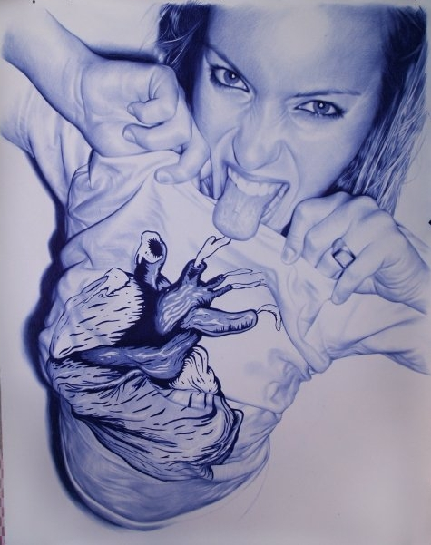
Spanish artist Juan Francisco Casas, who’s probably 33 at the time of writing this, uses up to four 14p ballpoint pens to create his stunningly photorealistic drawings, measuring up to 10ft (3 meters) high.
The use of pen balls makes his drawings even more peculiar, which certainly has played a big role in his way to success.
Juan’s source of inspiration comes from his own photographs of nights out with his friends, and his works are already a sell-out at exhibitions. You can only imagine how wild his parties is, as half of his drawings include girls that forgot to put on their clothes.
I'm a great fan of Juan's work. His drawings present so much skill and accuracy. I intend to draw my portraits just as perfectly and accurately, also I will be using a ball point pen too, similar to Juan, to draw on my colourful plastic sheets. I will be concentrating on showing a lot of detail and shading to make my drawings look realistic.
Artists Books Research 7
Portrait Drawings
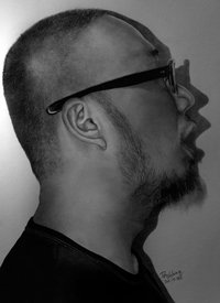
Paul Lung, a Hong Kong based graphic designer doesn't even use an eraser – all he needs is a 0.5 mm technical pencil, A2 paper and some time..Well, about 60 hours! (I don’t want to brag, but I could do the same thing in a minute with my camera).
His works are so photorealistic that people often don’t believe the pictures are not actual photographs. Paul even has to document his work process in order to prove his exceptional skills.
Paul Lung has always been an inspiration to me since I first discovered his work. I take interest in artists which can portray photograph looking drawings as I think it takes immense skill to be able to pull off the picture look. I'm a great fan of his work due to the amount of detail and even the use of simple black and white drawings without any use of colour. I'd love to be able to recreate my images in a way that they almost look like they were real photographs.
Artists Books Research 6
Portraits
Mariusz
was born in Poland ,
1962. Kaldowski is now a graphic designer, print maker and painted and
lives in Westerham in Kent .
He graduated in 1987 from the Academy
of Fine Arts in Krakow
with a MA in Fine Arts.
Mariusx has been creating and
successfully exhibiting his work since 1996, when he came to the UK . He
had held 153 exhibitions in the UK ,
104 solo exhibitions, 96 groups shows and 200 shows, 47 of which were
exhibitions.
Kaldowski began a
project name "Velis Passis" in 1993 which was completed in 1996. His
project consists of a series of portraits of famous Poles who have inspired
Mariusz through their achievements; these portraits had taken a couple of years
to complete. "Velis Passis" is an exceptional set of portraits of a
group of individuals who were helpful to the Polish cultural and political
revolution. He used inventive and wide brush strokes which focus mainly on the
facial features.
Mariusz decided to ask people that effected his spiritual life to pose for him. People who had a positive attitude to life, who were brave and also successful impressed Kaldowski, therefore he also painted them too. On his own website, Kaldowski Gallery, he which he designed himself, Kaldowski has states “Through meeting such individuality the chains of stereotypes of painting technique and portrait composition break. Here, this specific way of manifesting the personality dictates or even imposes the artistic solutions.”
I intend to take this technique as a great inspiration when using colours such as purple and blue as the most dominant colours. I will make use of plenty of different shades of different colours in hope to obtain a similar approach to painting portraits like Kaldowski.
Artists Books Research 5
Celebrity Portrait Paintings
HOWIE GREEN
HOWIE GREEN
Howie's portraits join traditional painting and digital
technology to imitate the style developed by Warhol, in his own unique way.
"I was looking for a way to do something with my art and with my growing
pile of computers and technology and I found it." Howie mentions his use
of colour and said, "I was in art school during the era, of Peter Max,
Yellow Submarine and the San Francisco
rock posters. What can I say? I guess it "coloured" my thinking!”
Howie stated on his own website “Andy Warhol made the
whole idea of "fame" more famous and he turned the idea of a
celebrity portrait into an art form. Treating already familiar images of
celebrities in artistic and interesting ways, Warhol, Steve Kaufman, Peter Max
and numerous artists showed new ways to present our favourite celebrities as
"Art". I use acrylic and various other media with my painterly
technique to create portraits that are hopefully as colourful and entertaining
as the celebrities themselves.”
Howie’s
Madonna piece uses acrylic and mixed media to add texture and life. When it comes to creating my final images, I intend to use enthusiastic colours which are cleverly used to show high and lowlights of the
face. Despite Howie’s piece
showing loose brush strokes and texture of the acrylic, I can see myself struggling to put into practice this approach as I am use to presenting precision and detail.
The painting of Biggie Smalls shows much more darker and shadowy colours which are used mainly to show his urban/hip hop genre along with Biggie’s race and background. Lighter colours make the image look as an artificial light could be lighting up Biggie Smalls which also emphasis the idea of dark colours used for dark shadows. I'd like to incorporate this technique of lighting to show where the light is hitting on my faces and where it’s not so visible. Howie’s painting show much bolder brush strokes of thick acrylic compared to his painting of Madonna. It appears to me as though Howie has avoided contact with water when using acrylics. When painting my image, I mixed a lot of my colours with water, mainly for the first layer of paint. This painting hasn't inspired me as much as the portrait of Madonna because after looking at it I felt it lacked time to make it appear professional. However there are plenty of lively colours present in Howie’s painting which showed me I could use more colours than just the primary and secondary colours.
Artists Books Research 4
Pop Art
Warhol’s portrait of Michael Jackson will be an influence in my
work as I'd like my portrait to be bright and colourful with the use of bold block colours along with
fine details like Warhol's work. Like his portrait of Michael, I don't intend to have my pieces heavily shaded to
look entirely realistic but I plan to have a more simplistic and almost cartoon like approach. When
drawing faces, I have always had the habit but also the intention of only drawing
the shape of the head, the main facial features, hair and the creases and folds
in clothing with slight shading to make it appear more related and
real, which is similar to Andy Warhol's technique. I have always preferred to draw a portrait that is from a medium close up
rather than used a close up of the face; this is because I feel like an image
of the face only presents a floating head, making it seem illusory. Andy Warhol has based his work on
people who are successful, famous and inspire him, I intend to use images of people
for my portraits who I feel are successful and inspiration to me.
I also intend to use the style in which Warhol has used himself as a
subject for his work as inspiration for my own work. My work will be mainly based
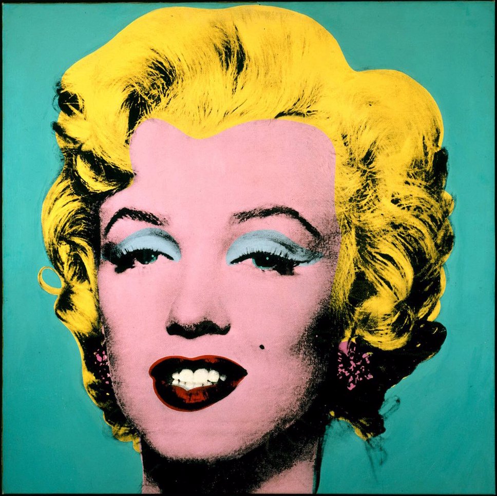
around me and people who have great meaning in my life. Warhol’s piece shows a
detailed print of his expression which was influenced by the events in his
lifestyle. In comparison to Warhol’s work, the faces that I plan to use will mainly have
a content and cheerful expression which gives an optimistic approach to my
work. Warhol has mainly used soft
and subtle colours in comparison to his portrait of Michael Jackson.
Artists Books Research 3
Etchings
REMBRANDT
Self Portrait
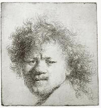
Rembrandt Harmenszoon van Rijn 15 July 1606 – 4 October 1669) was a Dutch painter and etcher. He is generally considered one of the greatest painters and printmakers in European art and the most important in Dutch history. His contributions to art came in a period of great wealth and cultural achievement that historians call the Dutch Golden Age when Dutch Golden Age painting, although in many ways antithetical to the Baroque style that dominated Europe, was extremely prolific and innovative.
I plan to reference by portraits to Rembrandt's work due to his sophisticated and old style. His paintings present realism and are extremely precise but the painting feel is still present. His etchings are rough but present the expressions of the face very well. I'd like to be able to show expressions and feelings through the faces I plan to draw without losing the identity of the person so that they're not recognisable any more.
Artists Books Research 2
Land Sea Sky
This little book was made from an old book, about an expedition from Miami to Canada, which included observations about the natural forms, wildlife, botany and ornithology of the areas along the way.
I thought this was a creative way to create a book. The use of using old books meant that the old books could be recycled and changed into a personal creation. Using different types of paper and pages and general text from other books gives a different background to work on as opposed to the plain simple white papered background.
Artists Books Research 1
Cutting Book Series
"Artists who make pieces, Artists who do books"
This book caught my attention as it looks like a magnificent sculpture. Although the book is more based on a sculpture type of approach, I thought if I was to go for this approach I'd still be able to make it personal to me through the remaining space of the pages and the way in which I sculpt the book.
Saturday, 15 February 2014
Make An Interpretation Research 10
Dismorfobina
I have considered the use of photography to present a phobia. These images reminded of a trainee teacher in my school years that took photographs of family and friends being concealed inside thick tights, which I related to claustrophobia. Therefore I thought I could possibly to the same through photography.
Subscribe to:
Posts (Atom)